Controlling Visibility
In the last post we discussed the appearance properties of our views and layers, giving them some visual content. But we only discussed how they appear, not whether they appear. It’s often convenient to control our views’ visibility separate from whether or not they’re in the view hierarchy. And we can take this one step further and control what portion of our views are visible. Let’s dive in!
To Draw, Or Not To Draw
Sometimes we want a view or layer to be in the hierarchy, but we don’t want it to be visible to the user at the moment. Fortunately both views and layers have a simple boolean property named isHidden that controls their visibility. By setting a view’s/layer’s isHidden property to true, that view/layer and everything in the hierarchy beneath it will be hidden. Visually this has the same effect as removing it from the hierarchy, but it will still be included as a subview/sublayer of its parent.
If you want a layer to be only partially hidden (or partially visible, however you want to look at it), you can instead set it’s opacity. The opacity can be set to any value between 0.0, meaning fully transparent, and 1.0, meaning fully opaque.
A layer’s opacity applies to all of its content, including sublayers, its border, and its shadow. Keep in mind this is multiplicative, so for example, a layer with a shadowOpacity of 0.3 and an opacity of 0.5 will have a shadow at 0.15 effective opacity.
Since sublayers are included in that, you can set the opacity of a layer to partially transparent to have its sublayers drawn at partial transparency. In many cases, this will look the same as setting the opacity of each sublayer individually… but not always! In particular, when sublayers overlap, their drawings are additive, whereas applying the opacity to the containing layer will render each sublayer then apply the opacity to the combined result.
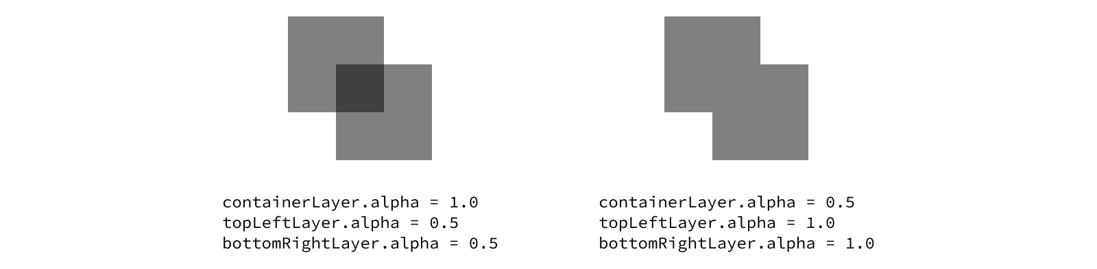
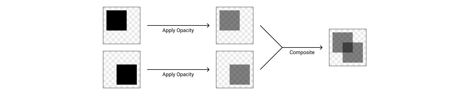
To better understand why this is happening, let’s think about how this is getting rendered at a technical level. When we set the opacity of each layer individually, the GPU is rendering each layer to an image, applying the opacity, then compositing those partially transparent images together to draw the container.
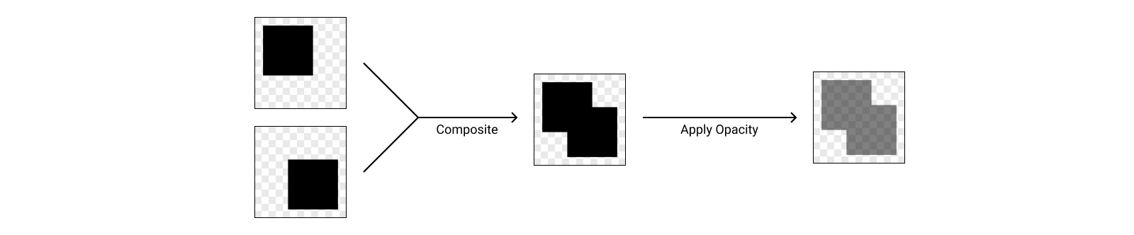
When we instead apply the opacity to the container, the GPU is rendering each layer to an image, compositing them into a single image for the container, then applying the opacity.
Layers provide a great abstraction on top of the GPU rendering pipeline, but this example illustrates how understanding what’s going on under the hood can make it way easier to debug visual issues and get the polished end result you want.
Views expose a convenience for setting their layer’s opacity via their alpha property. Updating the view’s alpha will set its layer’s opacity to the same value, and vice versa. You can think about the alpha property as being a wrapper around the layer’s opacity property, although it also has a few side effects when you set it that make it the recommended way to adjust visibility when working with views.
Interestingly, the
alphaproperty on views andopacityproperty on layers have different types. Layers measure opacity using aFloat, while views use aCGFloat. Historically these types were the same under the hood, but since the introduction of 64-bit architectures, aCGFloathas double the precision of aFloat.In practice, the additional precision of a
CGFloatwouldn’t make any visible difference in the rendering of the layer, so this isn’t really a problem. There is, however, a gotcha when it comes to this property: the view’salphais really just a passthrough to the layer’sopacity, which means if you set an alpha value on your view that can’t be represented exactly by aFloat, then read the property back, you may get a slightly different value back.
Displaying Images
All of the concepts we’ve discussed up until now have been possible with any view or layer. Some tasks require something a bit more specialized though. UIKit provides a wide variety of subclasses of UIView that make it easier to show specific types of content. For images, that’s UIImageView.
Setting up an image view is simple - just assign an image to the view’s image property. For the sake of example, we’ll use a local image loaded from the main bundle’s asset catalog, but any UIImage will work.
let imageView = UIImageView()
imageView.image = UIImage(named: "Hummingbird")

What happens if the size of the image doesn’t match the size of the view’s bounds though? For example, let’s set our image view’s bounds to a size of 200 by 200 points. This is smaller than our image and has a different aspect ratio (1:1 instead of 16:10). What will this look like?
The answer is… it depends. Specifically it depends on the view’s content mode. UIView provides a contentMode property that determines how the content should adjust to the bounds, which is important when the size of the bounds and the size of the content don’t match. The most common content modes you’re likely to use are related to scaling.
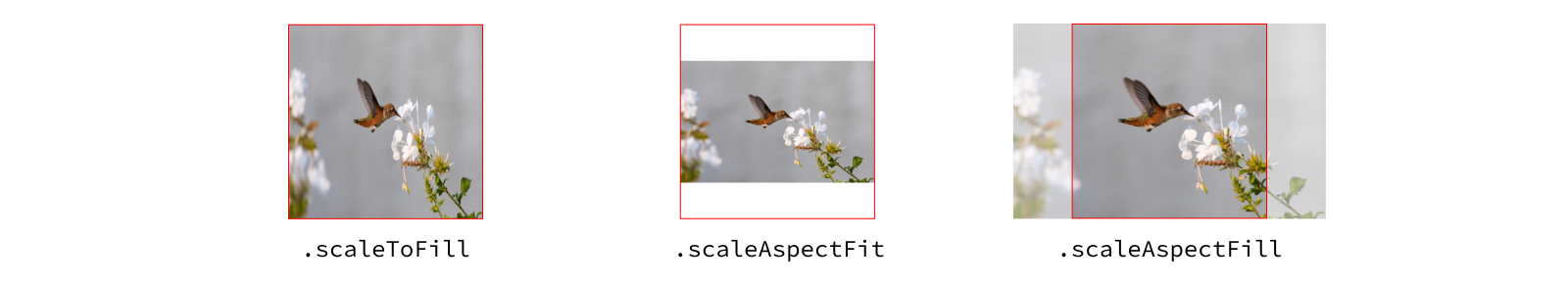
By default, views use a content mode of .scaleToFill. This causes the view’s contents to get squished/stretched to fill the bounds. You can see in our example the corners of the image still line up with the corners of the view, but the image itself looks squished because the aspect ratio doesn’t match the original image.
This is where the other two scaling content modes come in: .scaleAspectFit and .scaleAspectFill. Both of these modes will preserve the original aspect ratio of the content, avoiding any squishing or stretching. The difference between them is in how they size the content when the view’s aspect ratio doesn’t match the content. The “fit” variant will ensure that the entire content is displayed (the content fits inside the bounds, potentially leaving some blank space), while the “fill” variant will ensure that there’s no empty space in the view (the content fills the bounds, potentially cutting off some of the content).
In this example, the image is scaled down to fit/fill the bounds, since the image is larger. If the source image were smaller than the view, it would be scaled up instead. .scaleAspectFit will make the content as large as it can be while still fitting in the bounds (i.e. the least amount of blank space possible) and .scaleAspectFill will make the content as small as it can be while still filling the bounds (i.e. as little content outside the view as possible).
When you don’t want the view’s content to be scaled at all, you can use the set of content modes that only position the content within the bounds, always preserving the original size. These content modes are named after the position within the bounds where the content will be pinned: .center, .top, .bottomLeft, etc.

For each of these content modes, the specified position on the content will be aligned to the corresponding position in the view’s bounds. For example, the .topLeft content mode will align the top left corner of the content to the top left corner of the view’s bounds. Small content may not reach the bottom or right edges of the view, while large content may extend beyond those edges.
There’s one additional content mode called
.redrawthat works differently than the others. We’ll discuss that one in a future post since it’s related to a very different use case.
Note not all views (in fact very few) respect the content mode out of the box. This concept of clipping off part of the content of the view is an important model though, and something you’ll see in many different implementations. We’ll revisit content modes in a later post to see how else they can be useful.
For now, let’s get back to properties that affect all layers.
Rounding the Corners
Often, sharp corners don’t look quite right in an app’s UI. After all, many modern iOS devices don’t even have sharp corners on the physical screen! Layers make it easy to polish off the sharp corners using the cornerRadius property. By default, a view will have a corner radius of 0, giving it sharp corners. Increasing this value will smooth the corners.
Let’s take a look at how different radii look on a 200 by 200 pt view.
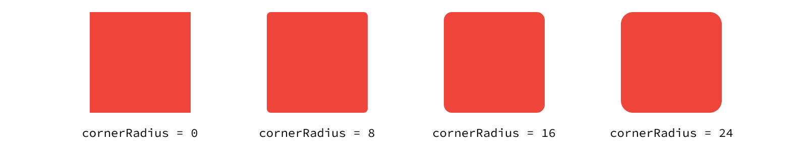
The renderer will round the layer by trimming the corners in the shape of a circle. As the name suggests, the cornerRadius controls this behavior by setting the radius of that circle, measured in points.

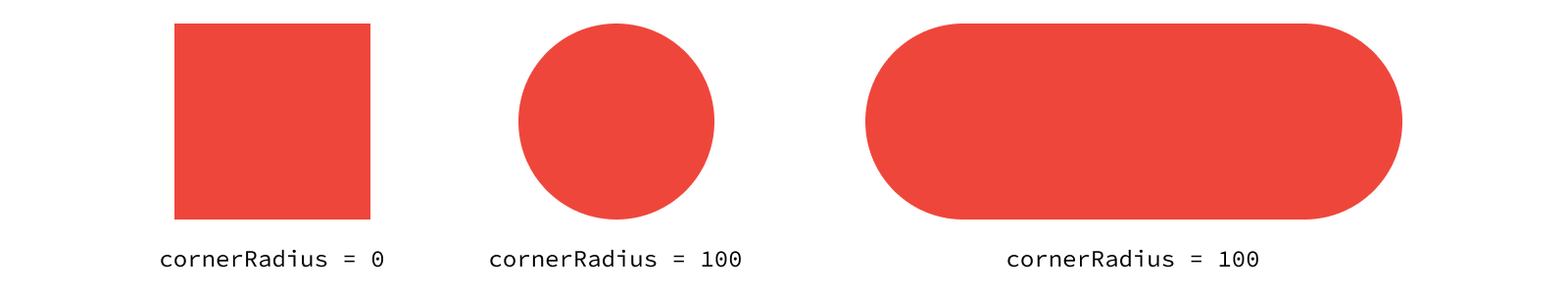
If you set the cornerRadius to half the minimum of the width and height of the view, there will be no straight portion of the shape on that side. For a square view, this gives you a perfect circle. Otherwise you’ll get a “pill” shape.
Let’s take a closer look at the bottom of our pill. The center of the bottom edge is a flat line as we would expect, but the curves are a bit different. Since we can’t actually perfectly represent a curve with square pixels, the system uses a technique called anti-aliasing to make the curve look smoother. By setting the transparency of each pixel along the edge of the curve to reflect how much of the pixel is filled by the circle, the system tricks our eyes into thinking we’re seeing a real circle.
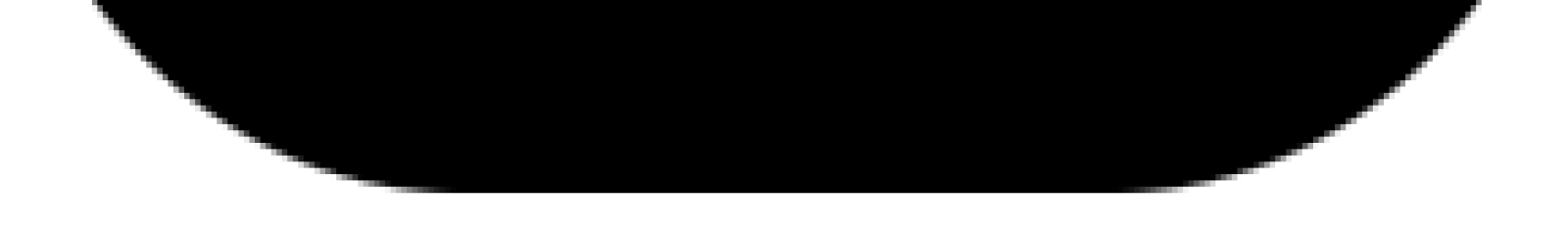
This is an incredibly powerful graphics technique you might notice if you look closely anywhere a shape doesn’t line up perfectly with pixel boundaries.
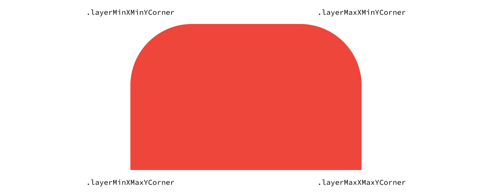
The default behavior when setting the cornerRadius is to round all of the layer’s corners. But what if you only want to round some of the corners? The maskedCorners property lets you determine to which corners the radius should be applied. For example, you could take advantage of this for a bottom sheet where you only want to round the top corners. This creates the visual effect that the view is coming out from the bottom of the screen, rather than floating above it.
layer.cornerRadius = 20
layer.maskedCorners = [.layerMinXMinYCorner, .layerMaxXMinYCorner]
Each option in the option set is named based on the X and Y coordinate in the bounds it relates to. So the top left corner is the min X and min Y, the top right corner is the max X and min Y, and so on.
Why such verbose names? Remember in the first post in this series we mentioned iOS uses a flipped coordinate space relative to that of macOS. Since Core Animation is a cross-platform framework, it names options in a manner agnostic to the direction of the coordinate space. iOS-only frameworks like UIKit can use simpler names for their option since they only need to support one coordinate space convention.
If you’ve rounded all your corners and still feel like your UI doesn’t quite match the style used elsewhere in iOS, don’t worry, there’s one final piece of the puzzle. While lots of elements in iOS are rounded, they aren’t technically using rounded rectangles. You might have heard the term “squircles” used to refer to these shapes, a hybrid of a square and a circle. Technically, the corner rounding they use is called a continuous curve, describing the fact that there is no abrupt point at which the curve begins. Layers have a property called cornerCurve that determines whether to use a traditional (“circular”) curve or this newer continuous curve.
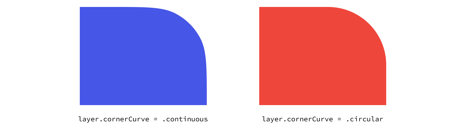
The effect is subtle, but it adds a nice touch of polish to make your UI feel more native to the system. To see what’s actually happening here, we can overlay the two corner curves, with .circular in red and .continuous in blue.

You may be surprised when you set a corner radius though that you sometimes don’t get the effect you expected. The corner radius is applied to the bounds of the layer. Appearance characteristics that are inherently tied to the bounds, such as a background color or border, will always have the corner radius applied. But other appearance characteristics such as the image of an image view or content from subviews can extend beyond the corner radius by default.
To understand what’s happening here, we need to dive into masking. A mask is a powerful tool that allows you to more precisely control what portion of a layer’s content is visible. When it comes to hiding the content inside the layer, you can think of the corner radius as rounding the corners of the layer’s built-in mask. The thing is, that built-in mask is disabled by default. To apply the corner radius to all of our content, we need to turn the mask on.
Masking Content
By default, layers can show content (including their sublayers) that is outside of the layer’s bounds. However, layers have the option of clipping the content outside of their bounds. This behavior is controlled by the layer’s maskToBounds property.
To demonstrate this, we’ll create two layers of different colors: a red layer at the top of the hierarchy with a blue layer as its sublayer. Toggling the maskToBounds on the red layer causes the region of the blue layer outside the bounds of the red layer not to be drawn.
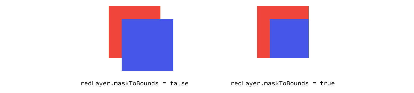
With this visual representation, we can now more easily see how the intersection of masking and rounding the corners works. We’ll apply a corner radius to our red layer, which rounds the visible red corners since they’re implicitly tied to our bounds. But the blue sublayer extends beyond the red layer’s bounds, so the corner radius has no effect. Once we turn on the built-in bounds mask, though, the corner radius will be visible on all four corners.

Views also has a property for enabling the built-in bounds mask, but with a slight rename to clipsToBounds. “Clipping” and “masking” are terms for the same concept.
The ability to mask what content is shown is a crucial component of building detailed user interfaces, and using the built-in bounds mask is only the tip of the iceberg. We’ll discuss masking in much more detail in upcoming posts where we explore many of cool visual techniques masking unlocks.