The Fundamental Appearance Properties of Views and Layers
The first couple posts in this series have focused on the mechanics of building up view and layer hierarchies and the properties used to arrange those hierarchies. But so far we haven’t talked about how to get our views and layers to show any content. In this post we’ll dive into making our UI look interesting by exploring three fundamental appearance attributes shared by all layers and with each of them open up a discussion into an interesting broader technical concept. Let’s get started!
Adding Some Color
The simplest way to make a view stand out is to fill it with color. And fortunately this is incredibly simple, all we need to do is set its backgroundColor.
view.backgroundColor = UIColor.white
By default, a view doesn’t have any background color (the property will be set to nil), giving the view a transparent background. As the name suggests, setting a UIColor here will show that color behind the other content in the view - such as any subviews, which may each have their own background color.
But while setting a background color might be a very simple API, there’s a lot more to think about when it comes to using color in your interface.
One piece of complexity to consider is Dark Mode. Users can enable Dark Mode to switch the system over to a darker color palette. While apps aren’t required to support Dark Mode, it’s always a good idea to adapt to your users’ preferred appearance settings whenever possible. Dark Mode can make it easier for users with light sensitivity to use your app1, and it can also improve their device’s battery life in some cases.
You can toggle Dark Mode in the Settings app, but during development you may find it tedious to go back and forth while testing. Fortunately, iOS provides a quicker way to do this. On your device, you can long press the brightness slider in Control Center to reveal an option to toggle Dark Mode. And when testing in the simulator, you can toggle the setting in Xcode’s Environment Overrides panel.
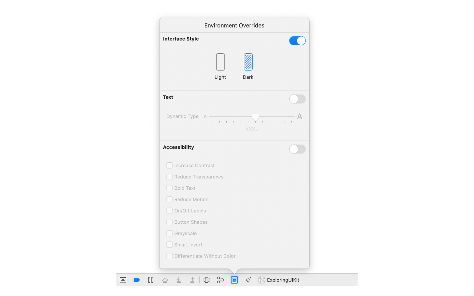
You can check whether Dark Mode is enabled by looking at your view’s trait collection, which describes the environment in which the view is shown. It’s important to check this for your individual view, rather than at a device level, since different parts of your view hierarchy may have different traits. You can access a view’s current traits via its traitCollection property. The trait we care about right now is the userInterfaceStyle.
Since the Dark Mode setting can be toggled while the app is open, it’s important to also listen for changes to the trait collection and dynamically update the interface when the setting is toggled. The easiest way to do this is to call registerForTraitChanges(_:handler:) and update the colors in the handler.
view.registerForTraitChanges(UITraitCollection.traitsAffectingColorAppearance) { (self: Self, _) in
    switch self.traitCollection.userInterfaceStyle {
    case .light, .unspecified:
        self.backgroundColor = UIColor.white
    case .dark:
        self.backgroundColor = UIColor.black
    @unknown default:
        fatalError("Unknown user interface style: \(traitCollection.userInterfaceStyle)")
}
One potential pitfall here is the initial value you set should always match the value you update to when the trait collection changes. It’s easy for these to get out of sync. A common code pattern is to move the switch statement into a private helper method, to ensure the same logic gets run each time. Sounds like a lot of work to set a background color, doesn’t it?
But wait - there’s an easier way! UIColor has an initializer that lets you automatically switch between different colors based on the current trait collection. These automatically-updating colors are known as dynamic colors.
view.backgroundColor = UIColor(dynamicProvider: { traitCollection in
    switch traitCollection.userInterfaceStyle {
    case .light, .unspecified:
        return UIColor.white
    case .dark:
        return UIColor.black
    @unknown default:
        fatalError("Unknown user interface style: \(traitCollection.userInterfaceStyle)")
    }
})
Using dynamic colors avoids the need for monitoring the trait collection, since the color will automatically update itself when the user interface style changes.
Since developers will often use the same color combinations for the same purposes, UIKit provides a set of predefined dynamic colors for a variety of use cases. These use semantic naming; in other words, they’re named after their intended use case, rather than describing the color itself. The semantic color for the background we’ve been describing (white in Light Mode, black in Dark Mode) is called systemBackground.
someView.backgroundColor = UIColor.systemBackground
Using these predefined semantic colors makes it very easy to support Dark Mode, as well as helps to ensure your app fits in with the iOS ecosystem2, since it will use the same color scheme as the built-in iOS apps and many other third-party apps. Of course, you can also specify your own dynamic colors, making your app’s interface match your specific brand.
Layers also have a property for controlling their background color, the identically named backgroundColor, and it works almost exactly the same. Almost, because it uses a different type. While views use a UIColor for their background, layers use a CGColor, from the Core Graphics frameworks. Core Graphics is a level down from UIKit and provides access to many of the mechanisms UIKit is built upon. In fact, UIColor is built on top of CGColor, and you can access a UIColor’s Core Graphics representation using its cgColor property. Be careful though, depending when you read the property you might get a different value back!
While CGColor powers UIColor, there is additional functionality in UIColor you lose with this conversion. Notably, CGColor does not handle dynamic colors. This is where the differences between Core Graphics and UIKit come in - Core Graphics provides lower level functionality for rendering graphics, such as drawing a certain color on screen; while UIKit provides higher level functionality for building interfaces, such as supporting system features like Dark Mode.
You can see how setting the background color on your view using UIColor will handle Dark Mode by setting a breakpoint in the handler passed into registerForTraitChanges(_:handler:) and checking the view’s and layer’s background colors. First, print the colors before activating Dark Mode.
(lldb) po self.backgroundColor!
<UIDynamicSystemColor: 0x600002c26660; name = systemBackgroundColor>

(lldb) po self.layer.backgroundColor!
<CGColor 0x600000f06670> [...] ( 1 1 )
Then repeat the same commands after toggling on Dark Mode.
(lldb) po self.backgroundColor!
<UIDynamicSystemColor: 0x600002c26660; name = systemBackgroundColor>

(lldb) po self.layer.backgroundColor!
<CGColor 0x600000f2b890> [...] ( 0 1 )
Notice the view’s background color hasn’t changed - it’s still the same instance of UIDynamicSystemColor. Of course, your view will most likely have a different memory address, but whatever that value is should be the same before and after toggling on Dark Mode. But unlike with the view, the layer has a totally new background color! UIKit handles this situation for us automatically inside the view, reapplying the new CGColor to it’s underlying layer whenever its traits change.
What’s that ( 1 1 ) and ( 0 1 ) in the color descriptions all about? It represents the values for the two channels of the color. The full description of the white color looks something like this:
(lldb) po UIColor.white.cgColor
<CGColor 0x600001fe0a00> [<CGColorSpace 0x6000018d0ae0> (kCGColorSpaceICCBased; kCGColorSpaceModelMonochrome; Generic Gray Gamma 2.2 Profile; extended range)] ( 1 1 )
Here we can see the color space is monochrome, which means we’ll have two channels of data: the brightness and the alpha. If we look at a color outside the monochrome space, we’ll see more values. For example, let’s take a look at red.
(lldb) po UIColor.red.cgColor
<CGColor 0x6000018c8fc0> [<CGColorSpace 0x6000018e4960> (kCGColorSpaceICCBased; kCGColorSpaceModelRGB; sRGB IEC61966-2.1; extended range)] ( 1 0 0 1 )
This is defined in an RGB color space, so there are four channels: red, green, blue, and alpha. And accordingly, we now get four numbers in our color’s description:
( 1 0 0 1 ). Since this is “pure red” we see the red channel maxed out, no green or blue, and full opacity.
When working with views, it’s generally better to assign a background color to the view itself, rather than its layer, so you can use dynamic colors and avoid having to deal with trait collections manually. If you’re working with a layer directly, though, and want to use a different background color for Dark Mode, you’ll need to watch for changes to the trait collection and reapply the color, since CGColor has no way to represent a dynamic color.
There’s one more potential gotcha that may not be obvious here: reading the cgColor property can return different values depending on when you read it. Specifically, it depends on the global “current” trait collection, which is set before UIKit calls certain special-cased methods, such as the handler for the registerForTraitChanges(_:handler:) method3.
If you need to use the cgColor property outside of these special-cased methods, the current trait collection may be close enough to give you the right color, but it’s safer to first manually resolve the dynamic color to a standard (non-dynamic) color using the trait collection of the view in which the color will be used.
_ = UIColor.systemBackground.resolvedColor(with: traitCollection).cgColor
Borders
Some layer properties can also add additional visual elements on top of the layer’s content, such as a border. Borders are controlled via two parameters: borderWidth and borderColor.
The borderWidth controls how thick the border is. A width of 0, the default value, indicates the layer should not show any border. Larger values indicate a border should be drawn of the specified thickness. Like most geometric properties in Core Animation and UIKit, this value is measured in points.
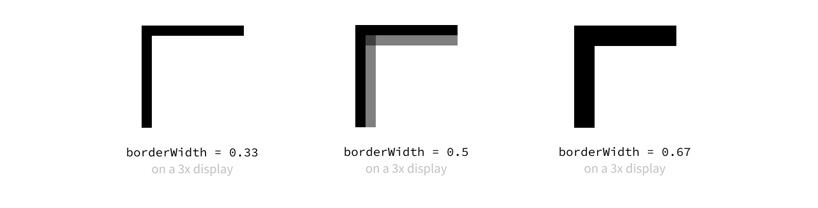
But the hardware our apps run on don’t have “points” on the screen, they have pixels. Working with points in our applications gives us a way to show things at roughly the same size across different devices, regardless of their pixel density. To get the sharpest borders, it’s best to use values that map to a whole number of pixels.
Since different devices have different scale factors, a measurement of the number of pixels per point, there’s no single interval we can use to ensure our values line up with pixel measurements. For example, on a screen with a scale of 2, it’s best to use point values in intervals of 1/2 point; whereas on a screen with a scale of 3, it’s best to use point values in intervals of 1/3 point. Using a value outside of the ideal interval will cause the edges of the border to appear soft, or fuzzy.
One easy way to ensure our borders line up with pixel boundaries is to always use whole point values (1.0, 2.0, etc.), but this limits how detailed we can be with our measurements. To find smaller ideal intervals, we can check the displayScale from our view’s trait collection and round our desired width to the nearest pixel value.
As you can imagine, borders aren’t the only place where aligning to the nearest pixel matters. Pixel rounding will be a recurring concept as we talk through view layout in upcoming posts, and we’ll discuss some utilities that make pixel rounding a breeze.
The other property for adjusting borders is the borderColor, which, as the name clearly indicates, controls the color of the border. This property takes an optional CGColor.
myView.layer.borderWidth = 2
myView.layer.borderColor = UIColor.darkGray.cgColor
Just like with background colors, the fact we’re using CGColor means we need to manually update our border colors when Dark Mode is toggled. Unlike with background colors, though, there is no equivalent property at the view level that takes a UIColor, so this is our only option.
myView.registerForTraitChanges(UITraitCollection.traitsAffectingColorAppearance) { (self: Self, _) in
    self.layer.borderColor = UIColor.someDynamicColor.resolvedColor(with: self.traitCollection).cgColor
}
The
resolvedColor(with: self.traitCollection)isn’t actually necessary here sinceregisterForTraitChangesis one of the special-cased call sites where reading thecgColorproperty directly is safe. However, I tend to include it whenever I’m accessing thecgColorproperty for the sake of consistency. In a large codebase, code gets copied around a lot, and it’s easy to miss this sort of subtle context when you’re copying code. By standardizing on always resolving dynamic colors, you reduce the mental overhead of always having to think about whether it’s safe to accesscgColor.
Borders are drawn on top of the layer’s content, including all of its sublayers. One important thing to note about adding borders is layers use inner borders, meaning the border is inset from the edge of the view.

Using inner borders means your layer’s border might be cover your content if it goes to the edge of the view. For example, applying a border to an image view means part of the image will be covered by the border. To avoid this, you can nest the view providing your content instead a slightly larger container view that provides the border.
On the flip side, one big advantage of using inner borders is the edge of the view doesn’t change, so the size of the bounds still represents all of the content, including the border. This makes it a lot easier to reason about the layout of your views. And this also makes borders a great tool to use for debugging your layout, since they allow you to easily visualize where your views and layers are on screen.
Shadows
While borders provide a very clear boundary to our layers, they can sometimes be a bit too sharp of an edge. Adding shadows can help differentiate layers in a more subtle way, while also giving the hierarchy a sense of depth by placing one layer visually in front of another. This ability to create depth is crucial in creating an easy-to-understand interface, as it gives users visual cues as to where to direct their attention and where to find certain content.
There are four main properties on the layer used to control its shadow’s appearance: shadowOpacity, shadowRadius, shadowOffset, and shadowColor.
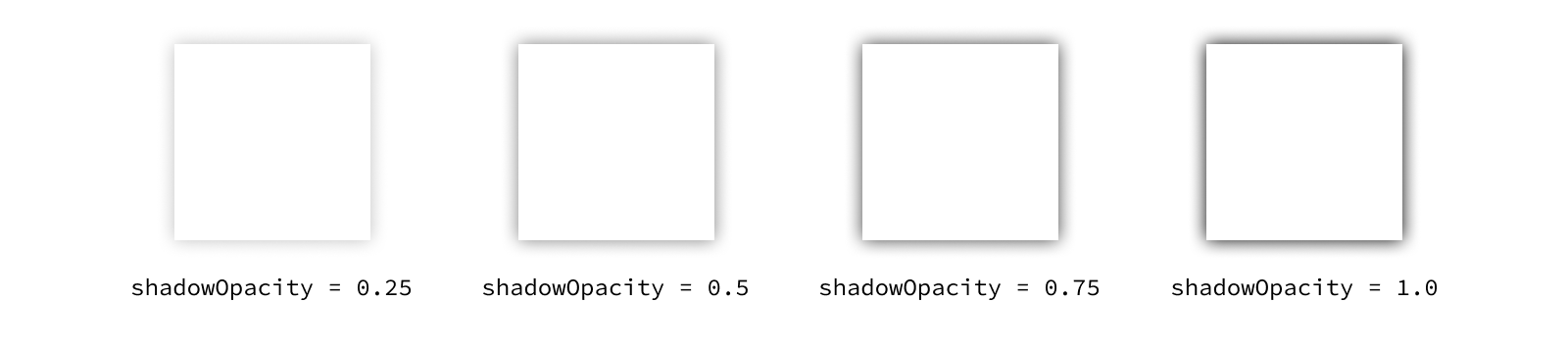
We’ll start with the simplest one: the shadowOpacity. This property controls the opacity of the layer’s shadow, where 0.0 means fully transparent and 1.0 means fully opaque. Values outside of this range will be clamped to 0 or 1 - you can’t have a shadow more transparent than completely invisible, right?
It’s tempting to crank your shadows all the way up to 1.0, but you’ll often find a lower opacity is sufficient to create the desired effect without being overpowering. Often very subtle effects in UI are preferable over their extreme variants.
The next property to think about is the shadowRadius. Shadows are drawn by taking the shape of the layer, rendering it in a single color, then blurring that rendering before it’s drawn to screen.
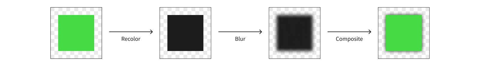
The shadow’s blur radius determines how sharp or blurry that rendering is. A radius of 0 will result in a perfectly sharp, monotone version of the layer, and larger values will cause the shadow to be less defined.
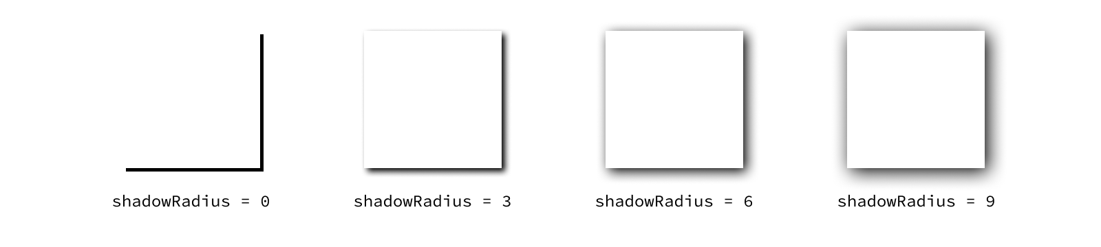
The property defaults to 3, which is usually a good place to start. The “right” value for any given use case will depend on the effect you’re going for.
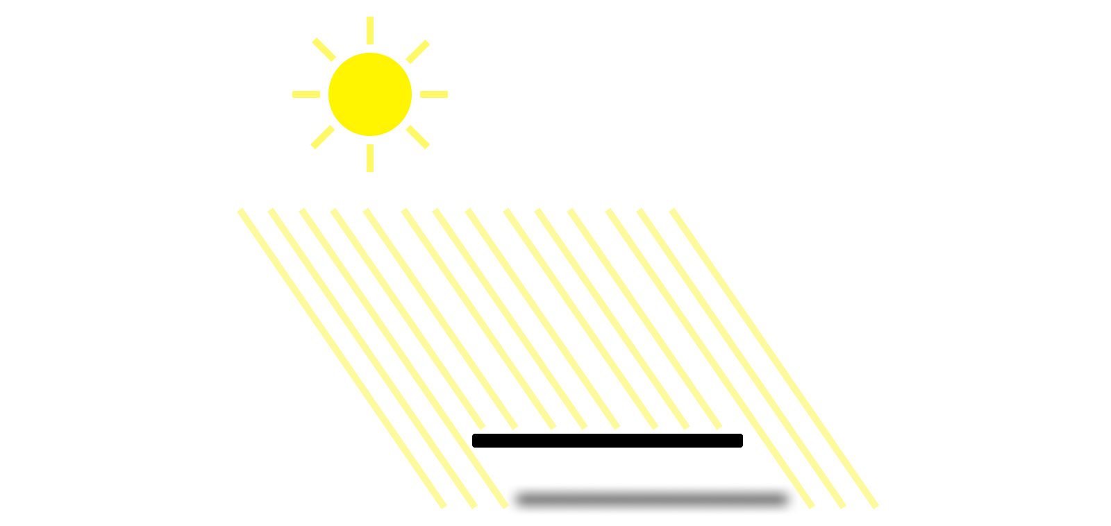
Once the renderer knows what the shadow looks like, it needs to determine where to place it. This is where the shadowOffset property comes in. Shadows are typically offset from the content they appear under. This offset is controlled by a pair of values measuring the offset along the x and y axes in points.

Again, the offset you’ll want to use is dependent on the effect you’re going for. But a good guideline to start with is to have consistent directionality of your shadows throughout the interface. Think about where your virtual light source is. Our brains know what shadows look like in the real world, so having inconsistent shadow directions across your app can often give a feeling of unease.
The final property to think about whenever you configure a shadow is the shadowColor. This property defaults to a solid black color, which is what you’ll usually want to leave it as. While you could use a color with a non-1 alpha channel to adjust the opacity of the shadow, it’s better to simplify things by relying only on the shadowOpacity for adjusting the opacity.
Like before, the shadowColor is set using a CGColor, so the same steps need to be taken if you want a different shadow color in Dark Mode. But before you implement that logic, stop and think about what you want the Dark Mode version of your UI to look like. While shadows can be very effective against a light background, they often fail to produce the same effect against a dark background. Many apps choose to turn off shadows completely in Dark Mode, preferring to instead use carefully-selected background colors to add depth to the hierarchy. Try experimenting with the predefined “secondary” and “tertiary” background colors to create this effect.
If you create a new layer, add a shadow to it, and look at it in your app, you might be surprised when you don’t see anything show up. This is because the shadow only gets drawn based on the layer’s content. If you create an empty layer, you won’t get any shadow. This behavior allows us to build complex shadows by adding a shadow to a layer whose content doesn’t fill its entire bounds. Let’s dive into an example to illustrate this.
let complexView = UIView(frame: CGRect(x: 0, y: 0, width: 100, height: 100))
complexView.layer.shadowOpacity = 0.5
complexView.layer.shadowOffset = .init(width: 0, height: 5)
complexView.layer.shadowRadius = 3.0

let firstSubview = UIView(frame: CGRect(x: 20, y: 20, width: 40, height: 40))
firstSubview.backgroundColor = UIColor.systemBackground
complexView.addSubview(firstSubview)

let secondSubview = UIView(frame: CGRect(x: 40, y: 40, width: 40, height: 40))
secondSubview.backgroundColor = UIColor.systemBackground
complexView.addSubview(secondSubview)
First, we’re creating a new container view, called complexView, and giving its layer a shadow. Then we’re creating two more views with overlapping frames, giving each of them a background color (so they have content), and adding them as subviews of our container. When we look at this view in our app, we’ll see that the shadow is around the edges of the combined shape of our two subviews, rather than the frame of the containing view.

This is incredibly useful behavior, since otherwise we’d have shadows coming from nowhere! That, or we’d have to contort our layer hierarchy to try to get the shadows to line up. Turns out adding separate shadows to each layer can quickly give some results that aren’t anything near what we wanted.

But this functionality can actually become problematic when we push it to its limits. Let’s think again about how the shadow is generated. The renderer must create a new canvas, draw each sublayer that contributes to the shape, color it all in with the shadowColor, blur the result by the shadowRadius, draw the shadow to the screen, then go back and draw each sublayer normally on top of it. When dealing with a large number of sublayers or having to render a large number of shadows, that can add up to a lot of work!
And all of this work needs to happen in a very short period of time in order for the renderer to have the frame prepared to display on screen. If the renderer isn’t able to complete the work in time, you can end up with noticeable performance issues in your UI, in this case what’s known as a render hitch. And nobody wants to deal with that.
A “hitch” refers to a frame appearing on screen later than it was scheduled. A render hitch refers to hitch caused by the render server taking too long.
There’s actually one more property you can optionally use to configure a layer’s shadow: the shadowPath. By providing a path for the shadow, you can let the renderer skip drawing the sublayers in order to get the shape of the layer’s content. Let’s provide a path for our view with the two overlapping subviews.
let path = CGMutablePath()
path.addRect(firstSubview.frame)
path.addRect(secondSubview.frame)
complexView.layer.shadowPath = path
Here we’re creating a mutable path and adding the two subviews’ rects in the container view’s coordinate space. This creates a path outlining the union of these rects.
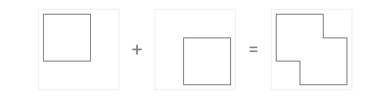
Visually this will look exactly the same as before, but now the renderer doesn’t need to draw the sublayers first to know what shape the shadow should follow. This is a significant performance improvement that took very little code. Of course, it won’t always be this simple to determine the path.
It’s always best to avoid overoptimizing for performance unless you expect there to be a problem. For example, if you are drawing this layer once and don’t expect any performance issues, it might be best to avoid adding complexity to your code and allow the renderer to figure out the shape of the shadow. If you start seeing render hitches in the app4, you can always go back and add in this optimization later.
As the hardware our apps run on becomes more powerful, performance optimizations such as using
shadowPathbecome less commonly needed. These days we typically only need to optimize shadows in extreme cases. However, it’s still a good idea to stop and think about how these sorts of performance issues can arise and consider different optimization techniques. Even if you don’t end up needing to optimize your shadow computations often, the same principles around optimization can be applied to other more expensive UI components. We discuss shadows here as a simple example of how we can work with system APIs to provide this optimization, but focus on the optimization pattern of providing pre-computed data rather than on the property itself.
While the shadowPath is often used for optimization, it can also be used to change the shape of the shadow to something else entirely. The shape of a layer’s shadow does not need to match its content. In fact, you could even use a shadow path to create a shadow for an empty layer with no content. Your imagination is the limit to what your shadows can be! And the available memory on your device, I suppose.
-
Dark Mode can also make it more difficult for certain users to make out text, though, such as those with astigmatism who experience a halation effect with light text on a dark background. For this reason you should support both light and dark color schemes, respecting the system Dark Mode setting, so users can select which works better for them. ↩
-
If your app also supports other platforms, such as watchOS or visionOS, you may notice certain predefined semantic colors appear slightly different across platforms. The colors could also change slightly between OS versions. For these reasons, if you’re trying to match system color schemes it’s best to use the predefined semantic colors instead of defining your own color values. ↩
-
You can find the full list of methods in Apple’s documentation for the 
UITraitCollection.current property. ↩ -
Check out the session “Demystify and eliminate hitches in the render phase” from WWDC 2023 to see how you can detect offscreen passes and figure out whether this is the right optimization to make. ↩