Cleaning Up Layout Code
Recommended read first:
As your design gets more complex, it’s easy for that complexity to find its way into your code. Without a reasoned approach to managing this complexity, your UI can become difficult to maintain and expand upon. So let’s avoid that! Here we’ll discuss some patterns and rules for building out your layout logic in a scalable and maintainable way.
Ordering Your Layout Code
As you break down a layout into different components, one of the first things to think about is the order of operations for laying out each piece of your interface. Thinking about the ordering up front can help you avoid getting deep into your layout logic and finding yourself stuck needing a value you can’t yet easily calculate.
The most important factor in ordering your layout operations lies in the dependencies between your subviews. In the simplest case, your subviews won’t have any dependencies. As an example, let’s think about a view where we want to include a picture frame. This frame will be made up of four subviews of a fixed size, one positioned at each corner of their parent view.
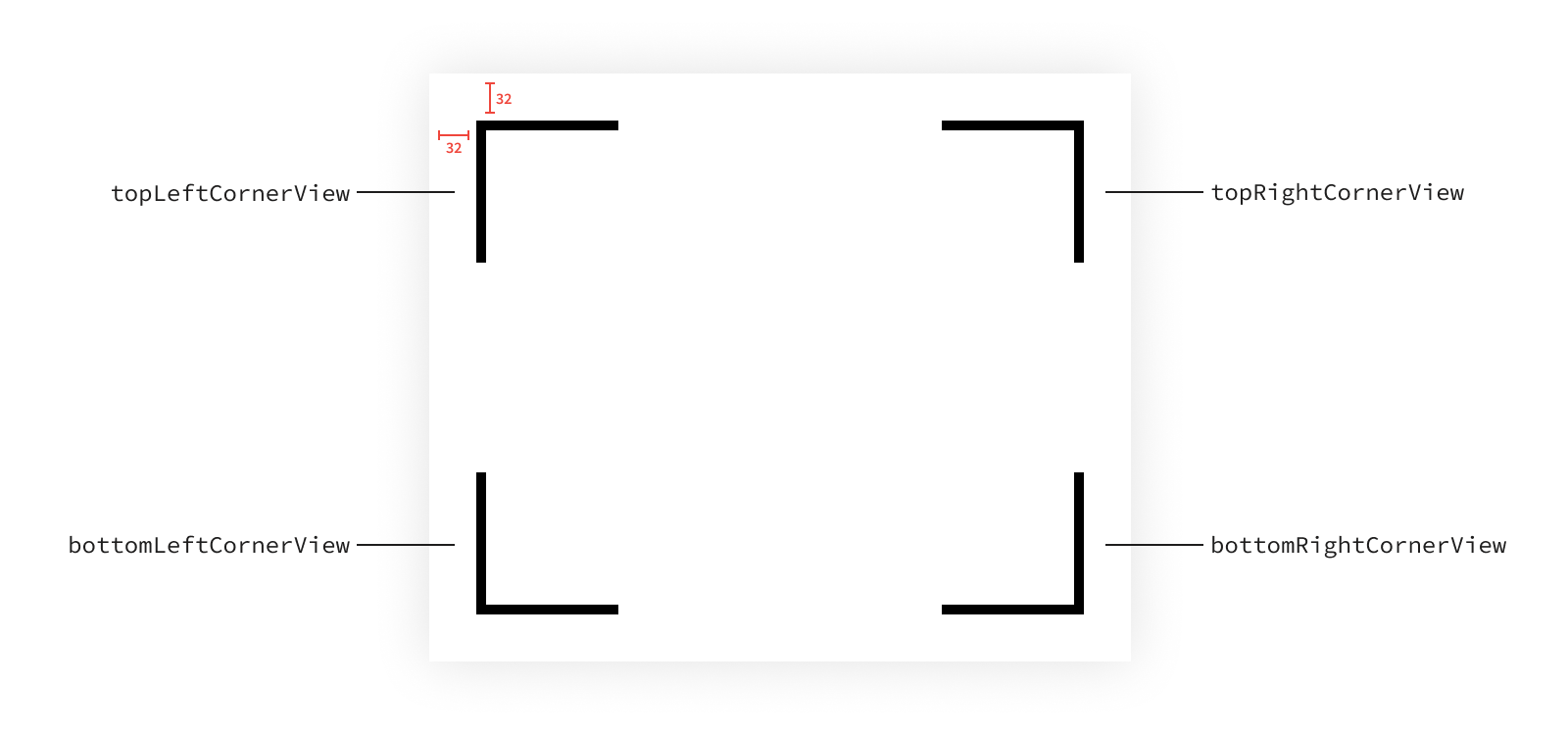
For the sake of this example, we’ll assume our view will always be large enough that the subviews won’t overlap and so we don’t need to worry about handling that case.
None of our subviews have a dependency on each other. Instead, they’re all relative to only their superview’s bounds. Since views perform layout after their bounds is updated, we can ignore this dependency.
There are still dependencies here though. Each subview has two components to its layout that we control: its size and its position. In order to determine its position, we first need to determine its size, and therefore every1 view’s position has a dependency on its size. So there are actually four dependencies2 in our layout. To illustrate this, we can draw a box for each subview, with dots representing each component of the layout and arrows representing the dependencies between those components.
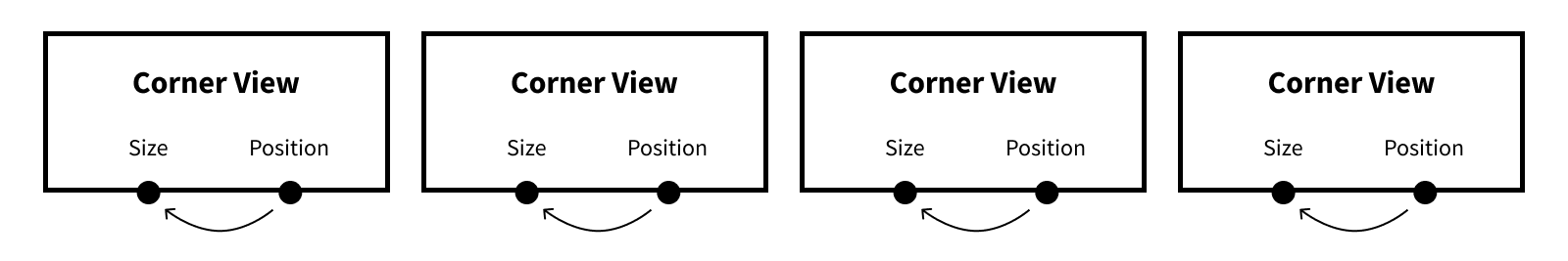
In this case, since there are no dependencies between subviews, it might be cleanest to size and align each view as a unit since we can reason about its layout independently. The only requirement is each view’s size must be set before its position.
override func layoutSubviews() {
    topLeftCornerView.sizeToFit(bounds.size)
    topLeftCornerView.align(withSuperview: .topLeft, inset: Metrics.cornerInset)

    topRightCornerView.sizeToFit(bounds.size)
    topRightCornerView.align(withSuperview: .topRight, inset: Metrics.cornerInset)

    bottomRightCornerView.sizeToFit(bounds.size)
    bottomRightCornerView.align(withSuperview: .bottomRight, inset: Metrics.cornerInset)

    bottomLeftCornerView.sizeToFit(bounds.size)
    bottomLeftCornerView.align(withSuperview: .bottomLeft, inset: Metrics.cornerInset)
}
This type of organization makes it easy to reason about each subview independently. But there are other ways to organize this layout code that would still meet the requirement of setting each subview’s size before its position. For example, we could size all of the subviews first, then assign each of them a position.
override func layoutSubviews() {
    topLeftCornerView.sizeToFit(bounds.size)
    topRightCornerView.sizeToFit(bounds.size)
    bottomRightCornerView.sizeToFit(bounds.size)
    bottomLeftCornerView.sizeToFit(bounds.size)

    topLeftCornerView.align(withSuperview: .topLeft, inset: Metrics.cornerInset)
    topRightCornerView.align(withSuperview: .topRight, inset: Metrics.cornerInset)
    bottomRightCornerView.align(withSuperview: .bottomRight, inset: Metrics.cornerInset)
    bottomLeftCornerView.align(withSuperview: .bottomLeft, inset: Metrics.cornerInset)
}
There’s no one right answer for the ordering. As long as each subview’s size is set before its position, your layout order will be valid. Now that we’ve seen a trivial case, let’s add a bit of complexity. Once you have dependencies between subviews, the ordering of the method is driven much more by that dependency structure.
A common dependency between subviews is for one subview’s position to have a dependency on another subview’s position3. As an example, say we have a loading screen made up of an activity indicator and a label. The activity indicator is always a fixed size and is centered in its superview. The label is sized to fit its text and is positioned beneath the activity indicator.
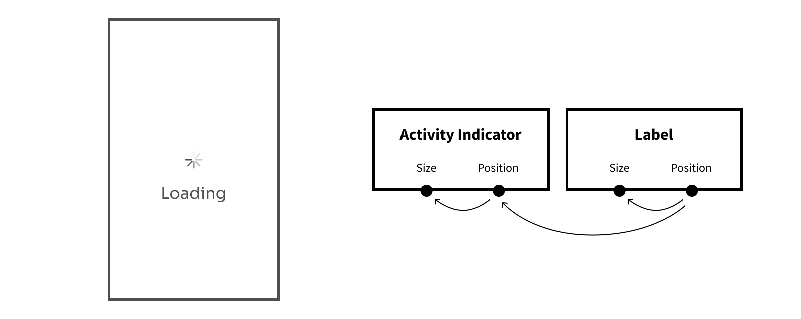
Since the label’s position depends on the activity indicator’s position, we need to ensure that dependency is resolved before we determine the label’s position. This still leaves us with multiple valid orders in which we can determine each component of the layout.
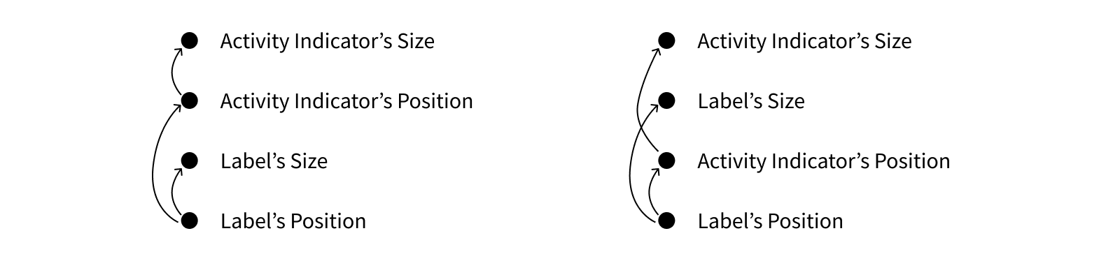
When we rearrange our dependencies into an order like this, the important part is that each arrow points upward. This indicates that each component’s dependencies will be resolved before its value is calculated. If an arrow points downward, that means a dependency won’t yet be resolved, and therefore the component won’t have correct values to work with.

Here you can see that this ordering isn’t valid since the label’s position can’t be determined before the activity indicator’s position. So instead, let’s use one of the valid orderings. Any valid ordering will work, but let’s go ahead and implement the second one.
enum Metrics {
    static let activityIndicatorSize: CGSize = .init(width: 48, height: 48)
    static let activityIndicatorToLabelMargin: CGFloat = 32
}

override func layoutSubviews() {
    activityIndicator.untransformedFrame.size = Metrics.activityIndicatorSize

    label.sizeToFit(width: bounds.width, constraints: .maxWidth)

    activityIndicator.align(withSuperview: .center)

    label.align(
        .topCenter,
        with: activityIndicator,
        .bottomCenter,
        verticalOffset: Metrics.activityIndicatorToLabelMargin
    )
}
Positions aren’t the only components that can have dependencies though. As another example, let’s take a look at a view where we show an image view with a label next to it. The image view will fill the space in the left of the superview, inset from the edges. The label will then be positioned to the right of the image view.
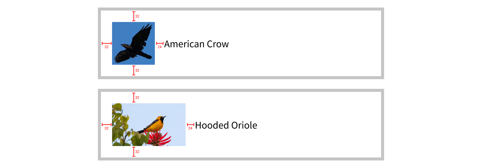
It’s clear the label’s position is dependent on the image view’s position. But there’s another dependency that isn’t clear from these examples. Think about this: what happens if the text in the label is too long to fit in the space to right of the image view? We most likely want to truncate the text so it fits, with some padding on the right so it isn’t touching the edge of the superview.
In order to determine how much width is available for the label, we first need to know the size of the image view. Therefore, the label’s size has a dependency on the image view’s size.

There are again multiple valid orderings that satisfy these dependencies. Let’s pick one and implement this layout.

enum Metrics {
    static let edgeInsets: UIEdgeInsets = .init(top: 32, left: 32, bottom: 32, right: 32)
    static let imageToLabelMargin: CGFloat = 24
}

override func layoutSubviews() {
    let layoutBounds = bounds.inset(by: Metrics.edgeInsets)

    imageView.sizeToFit(layoutBounds.size)

    let textLayoutBounds = layoutBounds.inset(
        left: imageView.bounds.width + Metrics.imageToLabelMargin
    )
    label.sizeToFit(width: textLayoutBounds.width, constraints: .maxWidth)

    imageView.align(withSuperview: .leftCenter, inset: Metrics.edgeInsets.left)

    label.align(
        .leftCenter,
        with: imageView,
        .rightCenter,
        horizontalOffset: Metrics.imageToLabelMargin
    )
}
As the complexity of our layout grows, the dependencies between views might grow as well. But by breaking down the dependencies between the sizing and alignment of each subview and ordering your code accordingly, you can ensure your layout code functions properly.
At first thinking through these dependencies might seem tedious, but it will quickly become second nature and you’ll only have to think about the dependency tree in complex cases. By understanding these dependencies in simple views, you’ll build a strong foundation for writing your layout code.
Extracting the Constants
One pattern you might notice in the examples above is including a Metrics type containing named layout constants. Extracting constants out of your layout code into named values is one of the easiest ways to make your code more legible. And wrapping these named constants in an enum is a great way to get some namespacing. Why an enum? An enum with no cases is an uninhabited type, meaning it can’t be constructed4. This makes it a good choice to use for namespacing since it’s harder to accidentally misuse.
enum Metrics {
    static let imageViewToLabelMargin: CGFloat = 16
}
Using named constants can make your code much more readable, but it’s only effective if you name your constants well. Imagine yourself updating the metrics at a later point as you’re trying to dial in the layout. Would you be able to tweak values in your layout simply by updating the constants in your metrics, or would you have to refactor your layout code with each change? Would you know what each metric controls by its name, or would you need to search for it in your layout code to see what all it would affect? Thinking about how you might change the values in the future can make it more obvious how you should structure them in the moment.
With that in mind, here are some guidelines for effective naming:
- Name your constants according to what they represent, not their value. Looking at the constant in the example above,
imageViewToLabelMargindescribes exactly how the value is meant to be used - it’s the distance between the image view and the label. Naming this something generic likesixteenwould have technically met the criteria for being a named constant, but it doesn’t express the meaning behind the constant. - Combine constants that intentionally have the same value. If the same value is used in multiple places that are intentionally equal, there should be a single constant that is reused and can be changed in one central place. For example, if a series of views should all be positioned the same distance inset from the edge, there should be a single constant representing that distance named in a generic way (e.g.
leftInset), rather than having a separate constant for each view’s inset. That way when you want to change how far the views are inset, there’s only one number to change, and the views can’t get out of sync. - Separate constants that coincidentally have the same value. On the other hand, if the same value is used in multiple places, but they just happen to use the same value right now and could reasonably differ in the future, they should use separate constants with names specific to how each value should be used.
Where does the negative space go?
We’ve talked a lot so far about ways to model the visual components in interface. But how about modeling the space between those components?
When arranging your interface, you often want to leave space between views to avoid a feeling of clutter. This is also a great way to create clear groupings of items, denoting which components of your UI are related and which are separate. But where do you define this negative space?
Pulling out named constants works great for individual views, but often we need to coordinate margin across multiple views. And often the same view could require different margins depending where it is used, so the values need to be dynamic.
There are generally two options when you want to add negative space around a view. The first is to add negative space outside of the view (inside its superview). The second is to add negative space inside the view (around its subviews).
To illustrate the difference between these options, we’ll look at a view provided by UIKit we haven’t explored yet: a UICalendarView. As the name suggests, this shows a calendar from which the user can select a date. Don’t worry about the details of this view, the important thing right now is it’s a view that contains a bunch of subviews (individual labels and buttons for each visual element within it).
Let’s make two calendar views: one with negative space outside the view and one with negative space inside the view.

Do you see the difference? Don’t worry, your eyes aren’t tricking you. They look exactly the same! To illustrate what’s actually different between them, let’s add a green background color to the calendar view.

When we add negative space outside the calendar view, the view itself is getting smaller since there’s still the same amount of total available space, so the calendar view now has less space available to it once we account for the negative space. When we add negative space inside the calendar view, it still shrinks its subviews by the same amount, but the calendar view takes up the full space.
Since the calendar view has no content showing its edge, these look identical. But as soon as we start styling the calendar view with a background color, or a border, or any other visual technique that gives it a well-defined edge, we start to see why differentiating these two approaches is helpful.
We’ve already seen how we can put space outside a view, by sizing the view to a smaller size and aligning it offset to other positions. Adding negative space outside of a view is the responsibility of its superview, implemented as part of its layout methods.
enum Metrics {
    static let edgeInsets: UIEdgeInsets = .init(top: 10, left: 20, bottom: 10, right: 20)
}

override func layoutSubviews() {
    let layoutBounds = bounds.inset(by: Metrics.edgeInsets)
    calendarView.sizeToFit(layoutBounds.size, constraints: .maxSize)
    // Note: This assumes the edge insets are vertically and horizontally symmetrical.
    calendarView.align(withSuperview: .center)
}

override func sizeThatFits(_ size: CGSize) -> CGSize {
    let availableSize = CGRect(origin: .zero, size: size).inset(by: Metrics.edgeInsets).size
    let calendarSizeThatFits = calendarView.sizeThatFits(availableSize, constraints: .maxSize)
    return CGRect(origin: .zero, size: calendarSizeThatFits).outset(by: Metrics.edgeInsets).size
}
Note the center alignment in layoutSubviews() assumes the edge insets are vertically and horizontally symmetrical. We’ll learn about an abstraction to avoid needing to make this assumption shortly.
It’s important to account for the negative space around the subview in both the layoutSubviews() and sizeThatFits(_:) implementations. In this case, only the parent needs to know what the values are - the calendar view has no knowledge of how much, if any, negative space is around it.
Adding negative space inside a view, on the other hand, is the responsibility of the view itself. Views can automatically add space around their content without views higher in the hierarchy knowing how much of their size comes from their content/subviews vs. negative space. That said, the amount of negative space can be suggested by the parent (“suggested” because the view isn’t required to use the specified value). In fact, there’s a property of UIView that serves this exact purpose: layoutMargins5.
override init(frame: CGRect) {
    super.init(frame: frame)

    calendarView.layoutMargins = .init(top: 10, left: 20, bottom: 10, right: 20)
    addSubview(calendarView)
}

override func layoutSubviews() {
    calendarView.sizeToFit(bounds.size, constraints: .maxSize)
    calendarView.align(withSuperview: .center)
}

override func sizeThatFits(_ size: CGSize) -> CGSize {
    return calendarView.sizeThatFits(size)
}
Note the calendar view’s layoutMargins are set in its parent’s initializer in this example. While you don’t need to set them that early (and it’s okay for the layout margins to change), it’s important to ensure they’re set before any layout occurs. Since sizeThatFits(_:) takes the current layoutMargins into account, changing the layoutMargins will change the view’s ideal size.
Just as the calendar view’s ideal size changes when its layoutMargins is updated, your custom view subclasses should take their layoutMargins into account in their sizeThatFits(_:) implementation if they use it for layout. We can take the example of our calendar wrapper class as we defined it above, replacing the edgeInsets constant with the view’s layoutMargins.
override func layoutSubviews() {
    let layoutBounds = bounds.inset(by: layoutMargins)
    calendarView.sizeToFit(layoutBounds.size, constraints: .maxSize)
    // Note: This assumes the edge insets are vertically and horizontally symmetrical.
    calendarView.align(withSuperview: .center)
}

override func sizeThatFits(_ size: CGSize) -> CGSize {
    let availableSize = CGRect(origin: .zero, size: size).inset(by: layoutMargins).size
    let calendarSizeThatFits = calendarView.sizeThatFits(availableSize, constraints: .maxSize)
    return CGRect(origin: .zero, size: calendarSizeThatFits).outset(by: layoutMargins).size
}
Of course, a simple wrapper around another view is a trivial example of insetting content, but the same pattern can be followed for any view that adopts its layoutMargins:
override func layoutSubviews() {
    let layoutBounds = bounds.inset(by: layoutMargins)

    // Arrange the subviews within the `layoutBounds`.
}

override func sizeThatFits(_ size: CGSize) -> CGSize {
    let availableSizeForContent = CGRect(origin: .zero, size: size).inset(by: layoutMargins).size

    // Calculate the ideal size for all of the content to fit based on the available size.
    let idealContentSize = ...

    return CGRect(origin: .zero, size: idealContentSize).outset(by: layoutMargins).size
}
Remember the child view isn’t required to adhere to the layoutMargins. Or, it could apply those margins to only some of its content. Many system-defined views implement layoutMargins in a similar way, but when writing your layout code it’s important to remember views won’t always be completely empty in their margins.

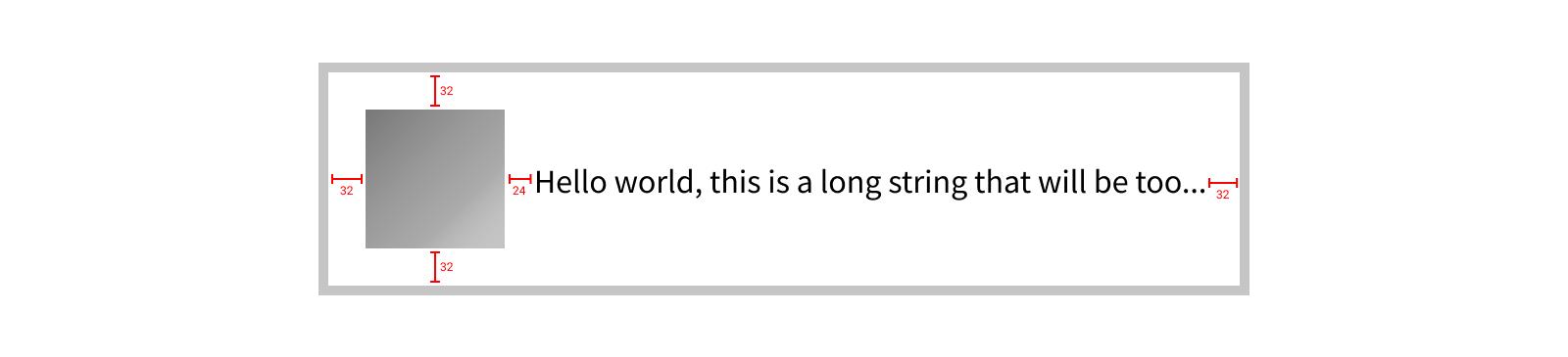
As an example, take this speech bubble for which we’ve set horizontal layout margins of 32 pt and vertical layout margins of 24 pt. But the tail of the speech bubble extends into these margins. This can be an incredibly valuable behavior since we might want to visually align the body of the bubble with other bubbles that don’t have a tail. This way we can toggle on or off the display of the tail and not need to account for it when setting the insets, allowing the size of the tail to be an implementation of the speech bubble component rather than being exposed to consumers.
But what if we wanted to sometimes align the view based on the body and other times based on to the tail? For that, we can utilize alignment proxies.
Alignment Proxies
View alignment is a powerful abstraction on top of calculating view positions, but there is often still some math involved when it comes to things like applying offsets/insets. Extending the abstraction to account for these offsets can make your layout code much more expressive.
As an example, imagine we have a subview we’d like to align to the top right corner of our view’s bounds inset by its layout margins. Our alignment code might look something like this:
override func layoutSubviews() {
    subview.align(
        .topRight,
        with: self,
        .topRight,
        offset: UIOffset(
            horizontal: -layoutMargins.right,
            vertical: layoutMargins.top
        )
    )
}
Here we’re aligning the top right of our subview to the top right of our bounds, offset to the left by our right edge’s layout margin and down by our top edge’s layout margin. In writing or reviewing this code, it would be easy to miss a flipped sign on one of the layout margin values, resulting in shifting our subview outside our bounds, rather than insetting it.
This gets even more complicated when dealing with offsets that change based on the user interface layout direction. Instead of always aligning to the top right, we may want to align the top trailing edges to account for RTL layout. Now we need to calculate our offset based on the layout direction and select the appropriate edges and signs.
override func layoutSubviews() {
    subview.align(
        .topTrailing,
        with: self,
        .topTrailing,
        offset: UIOffset(
            horizontal: effectiveUserInterfaceLayoutDirection == .leftToRight
                ? -layoutMargins.right
                : layoutMargins.left,
            vertical: layoutMargins.top
        )
    )
}
To avoid this potential problem, we can align to something else that is inset by this amount. One simple implementation of this might be adding a second subview that can act as a proxy for our view’s bounds inset by the layout margins.
override func layoutSubviews() {
    proxyView.untransformedFrame = bounds.inset(by: layoutMargins)

    subview.align(
        .topTrailing,
        with: proxyView,
        .topTrailing
    )
}
This makes our layout code much simpler and more expressive, since we’re no longer directly switching over the effective user interface layout direction. Of course, this will also add another view to our view hierarchy, which is not ideal. To avoid this, Paralayout allows for the use of alignment proxy objects that are not views themselves, but rather enable aligning to a view as if it had a different coordinate space.
In our case, we can use the layoutMarginsAlignmentProxy, which will allow us to align to our view as if its top right corner were inset from its actual location by the view’s layout margins.
override func layoutSubviews() {
    subview.align(
        .topTrailing,
        with: self.layoutMarginsAlignmentProxy,
        .topTrailing
    )
}
Remember in our calendar view example earlier we talked about the assumption it made regarding the layout margins being symmetrical? Using an alignment proxy would allow us to avoid this assumption, since the center of the layoutMarginsAlignmentProxy would automatically take into account any asymmetry in the margins.
Applying layout margins isn’t the only use for alignment proxies though. You can create custom alignment proxies to support alignment to any inset or arbitrary rect within a view. This typically takes the form of a computed property on the view exposing an alignment proxy in its public API.
Using our earlier example of the speech bubble view, we might expose a pair of alignment proxies that make it easy to align to the bubble with or without a tail.
var bodyAlignmentProxy: Alignable {
    // The body is inset by the layoutMargins, so we can just use the `layoutMarginsAlignmentProxy` here.
    // This is also equivalent to using:
    return alignmentProxy(insetBy: layoutMargins)
}

var bodyWithTailAlignmentProxy: Alignable {
    // First find the body (using the layoutMargins), then outset by the tail size.
    return layoutMarginsAlignmentProxy.alignmentProxyInsetBy(right: -Metrics.tailWidth)
}
Note we aren’t using the positions of any subviews here to define the alignment proxies (e.g. we aren’t using the body view itself to compute the body alignment proxy), but rather computing where those subviews will be. This is preferable when it’s reasonable to calculate these values, since it allows the parent view to finish its layout before the children. However, it you must use subview positions or sizes to compute the alignment proxies, make sure to call layoutIfNeeded() first to ensure the subviews have their final layout values.
-
There’s exceptions to this, of course. But this holds true for the vast majority of layout cases, so it helps to keep this mental model. ↩
-
We can also ignore things like dependencies on constants, since that dependency is guaranteed to always be resolved. ↩
-
This also means there’s an implicit dependency on the other subview’s size, since each view’s position has a dependency on its size. We’ll omit these from our graphs for the sake of simplicity. ↩
-
The most well-known uninhabited type is
Never, the return type for methods likefatalError()that can never return. ↩ -
While you could easily implement your own property to control the negative space of a view (and there are often good reasons to do so), the
layoutMarginsproperty has some special behavior that can make it a convenient mechanism for propagating negative space, namely through mechanisms like thepreservesSuperviewLayoutMarginsproperty, as well as their interactions with safe areas. ↩